RingCentral - Balance
As part of a larger advertising campaign for Ring Central, NotReal was requested to work on four animated pieces and images that could tell how easy, stable and secure it is to use this app, having the idea of balance as the hero concept.
The request included the development of four different compositions immersed in stages related to the main industries the app focuses on: Education, telehealth, and two different kinds of offices; one more conventional and the other a little bit more relaxed.
So for these four visualizations, our challenges were two:
- How could we better represent balance, as a way to highlight stability and security
- How to represent the environments requested in a simplified, minimal way.
- How could we better represent balance, as a way to highlight stability and security
- How to represent the environments requested in a simplified, minimal way.
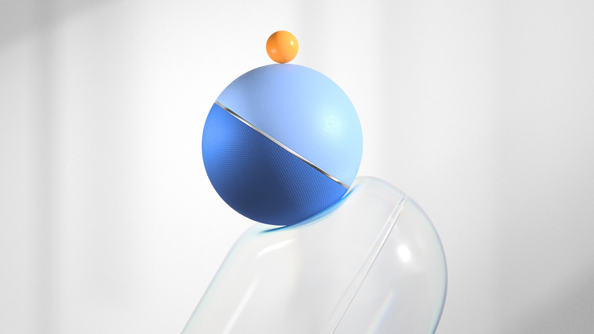
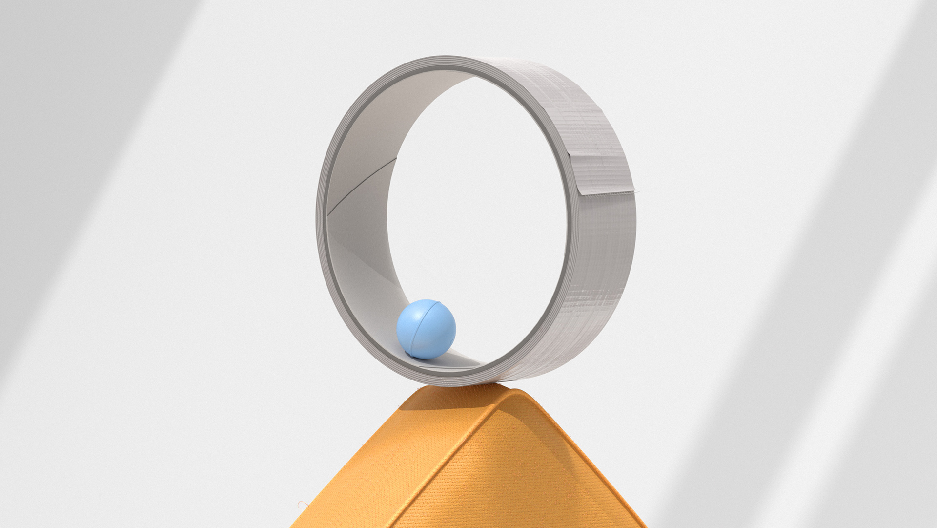
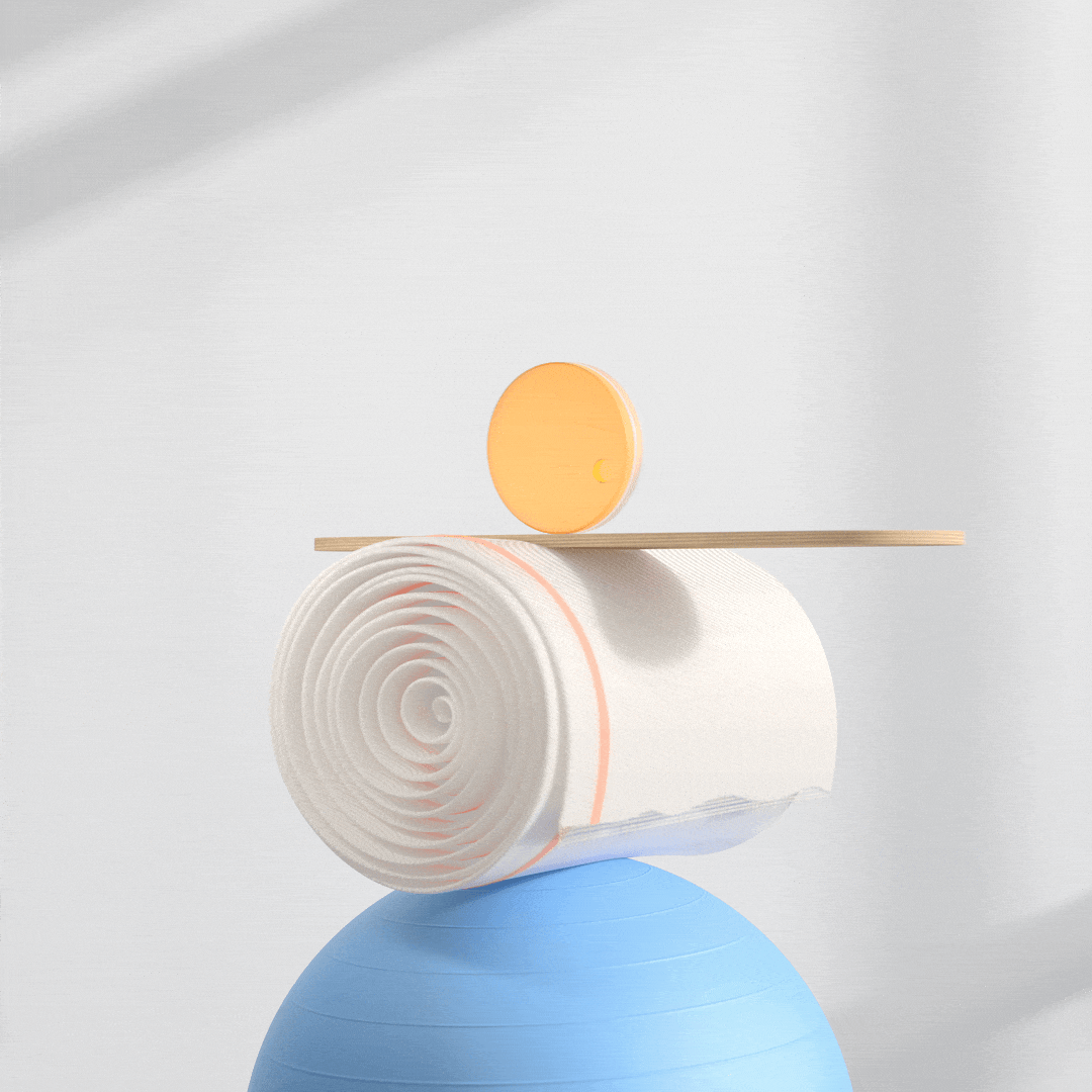
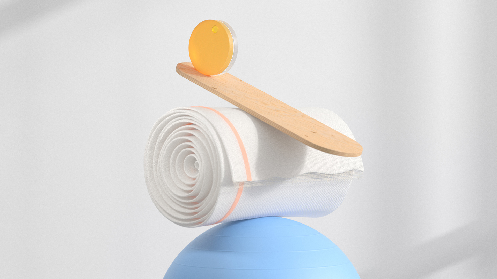
We came up with a specific compositions for each setting and combined a mix of literal and abstract objects to develop totems that would feel balanced and harmonious, but also dynamic.
For the background environments, we worked on artful abstractions of real work settings. Minimal and beautiful, but with some textures and details that take inspiration from the real world that make these images hyperrealistic, keeping enough clear space around the objects to give a sense of openness. All with a premium and refined look.
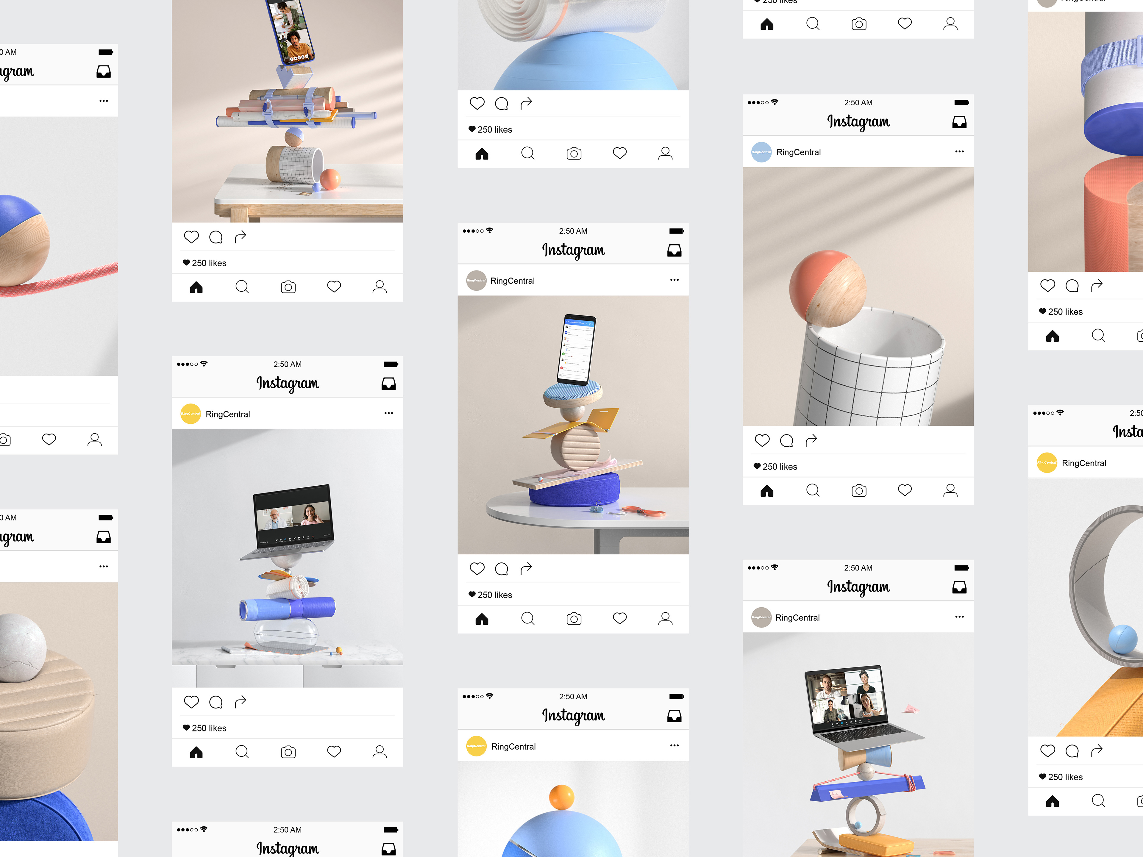
Let's take a look!
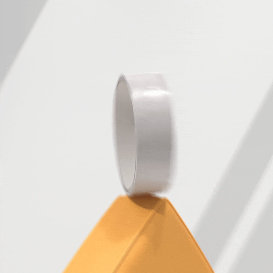
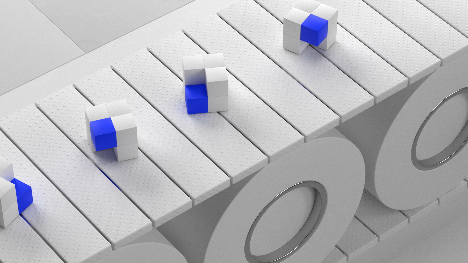
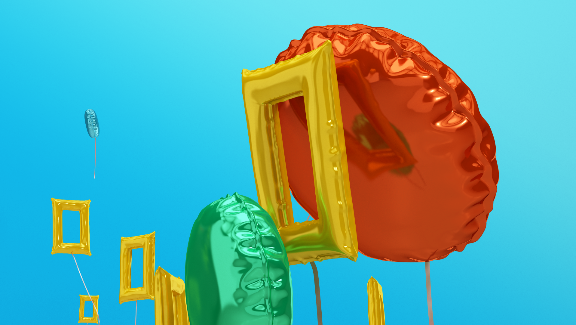
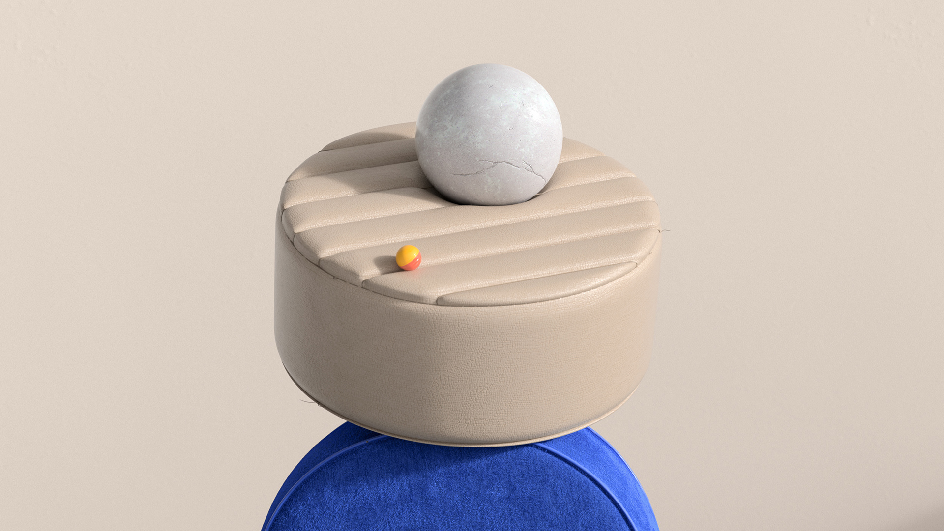
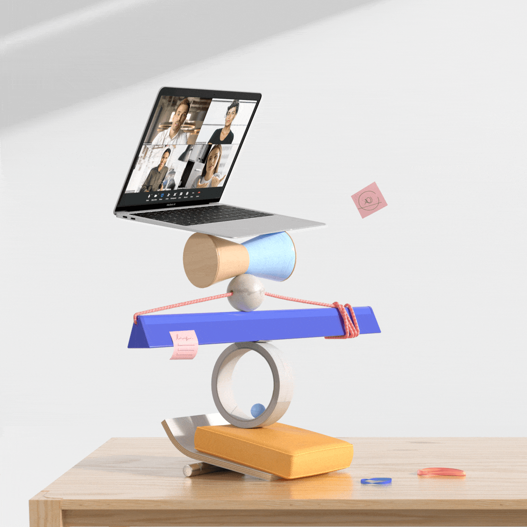
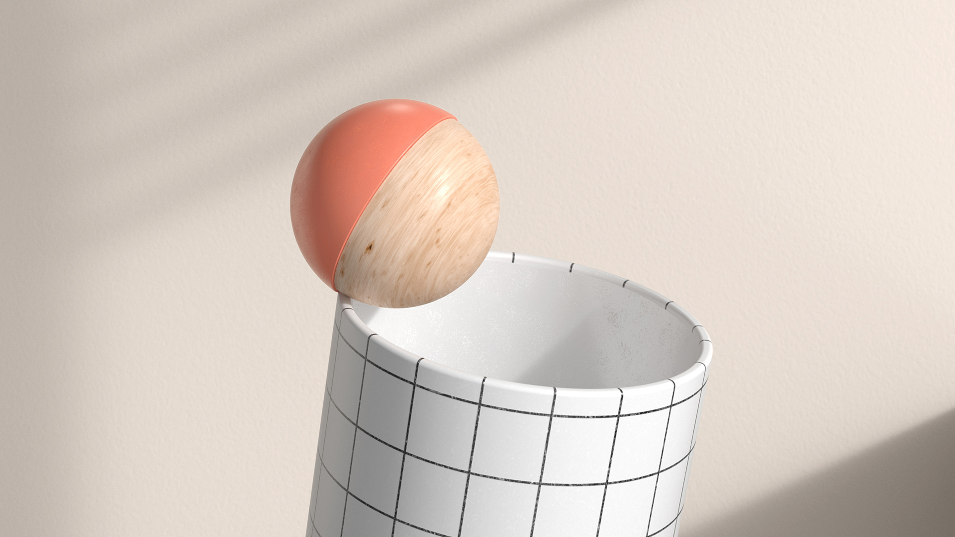
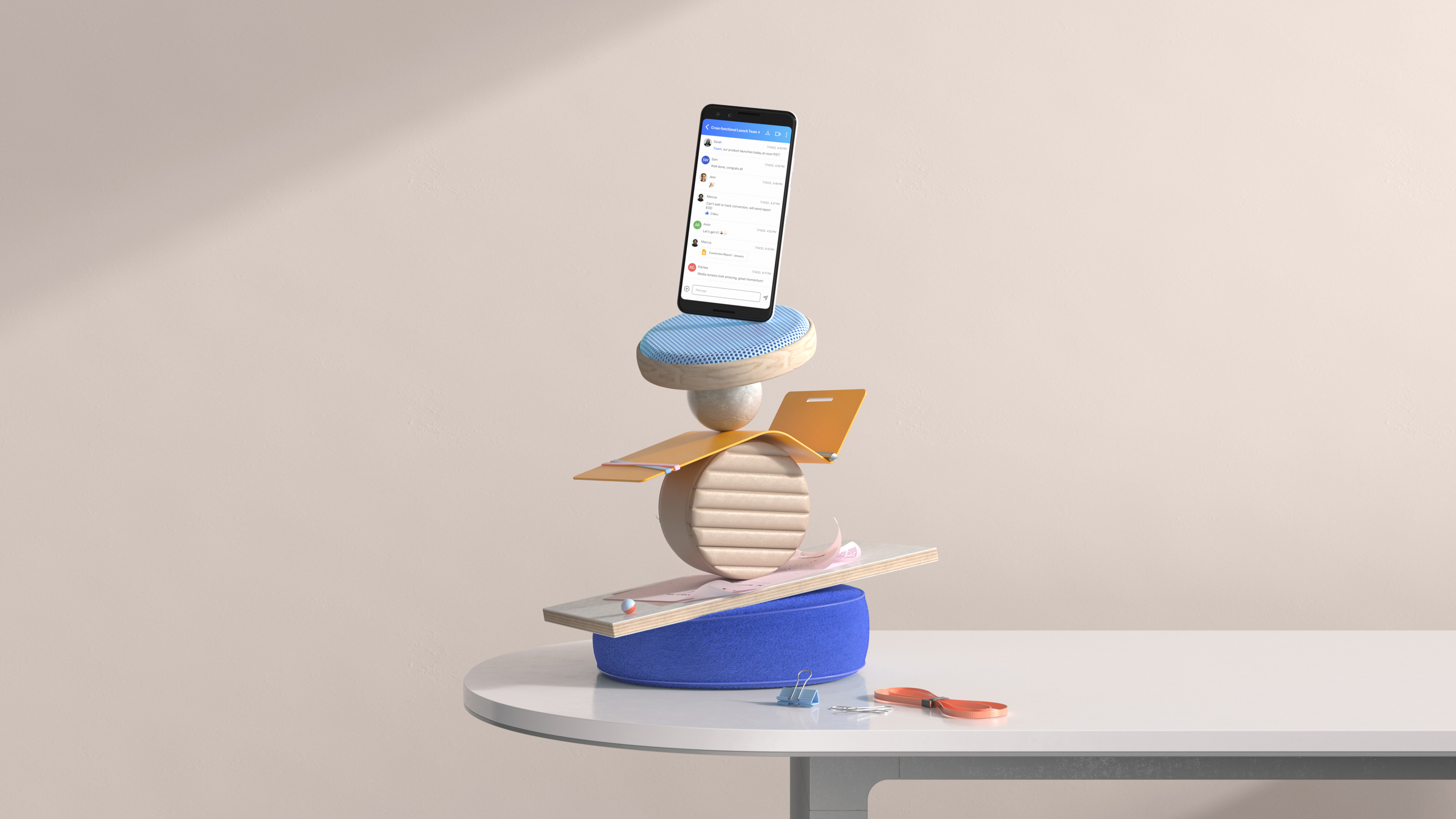
For this first generic composition of an office, we worked with the idea of a modern space, but using just a few objects as an abstraction of what it could be a studio office or a co-working space; this one had to feel personal and warm.
On the totem, a mix of abstract and figurative objects take inspiration from the ones that could be in a studio’s personal desk: simple shapes that use materials taken out of a chair, some notes, a shape that looks like a tape, and something that resembles a prototype in development without getting too literal.
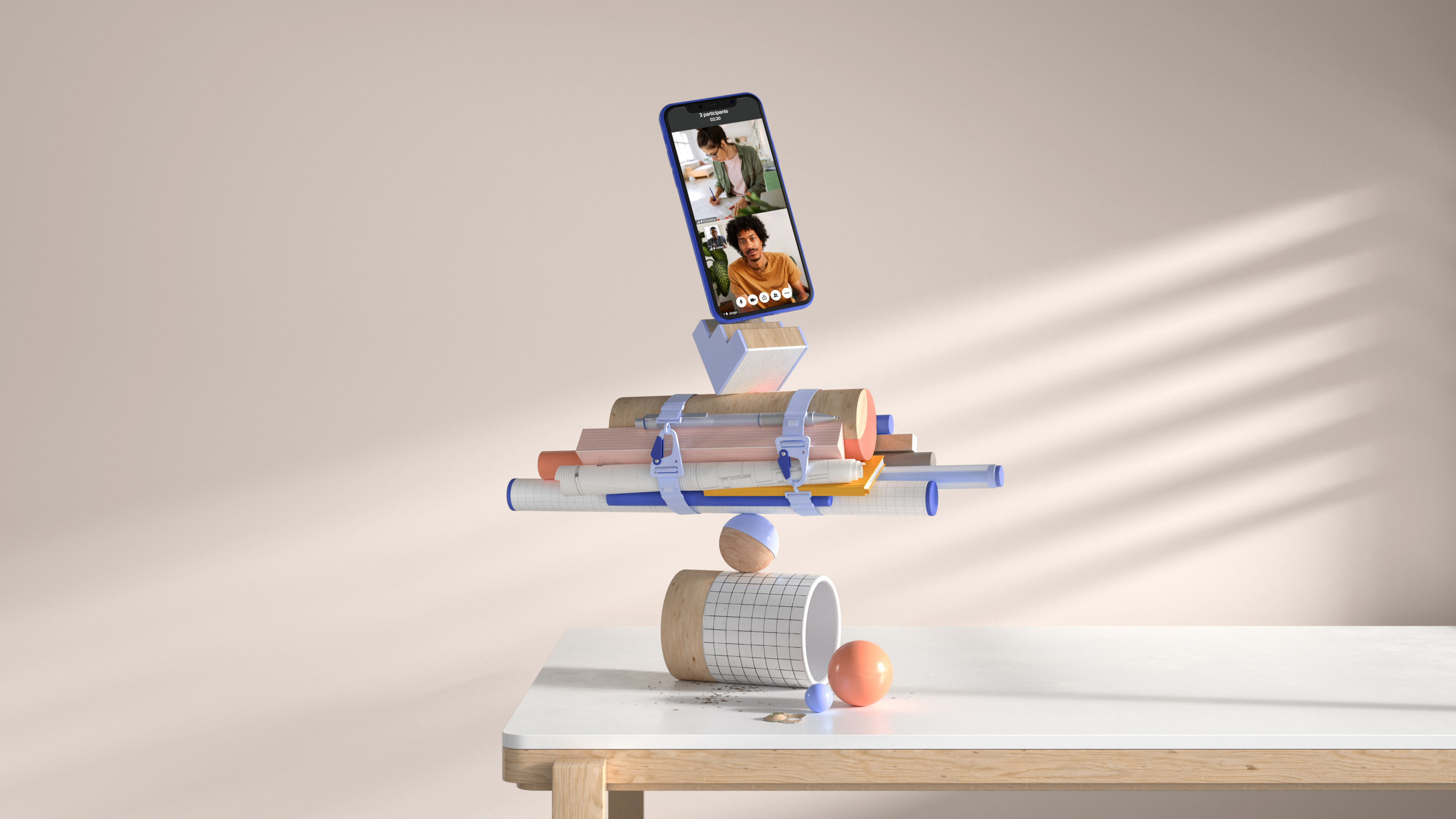
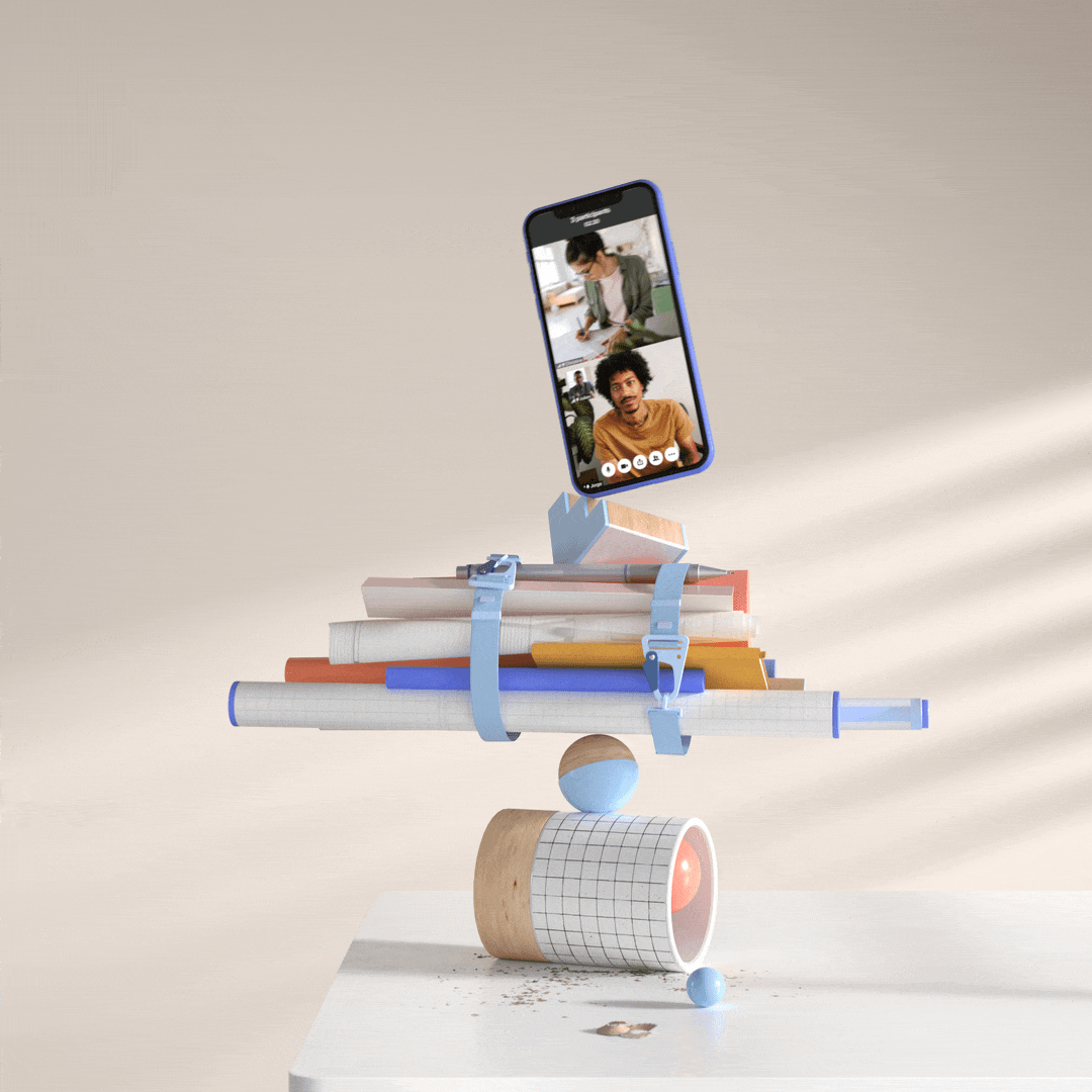
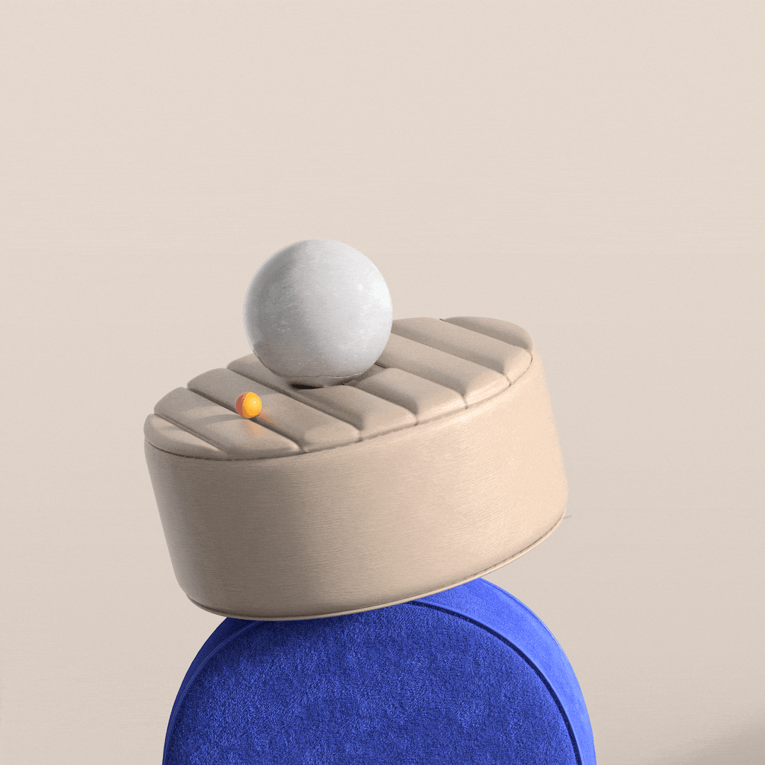
For the education image, we developed a clean, fresh, calm and young vibe. The light is bright and energizing, combined with warm tones on the background for a home feeling.
On the totem, a mix of with abstract and figurative objects without being too literal take inspiration from library and stationary, and some are held tight by two plastic hooks that resemble the ones of a backpack as our input on security.
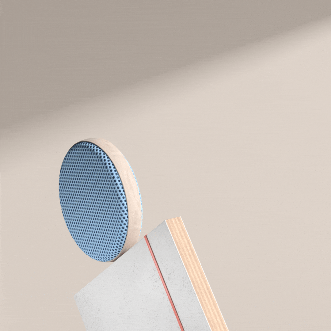
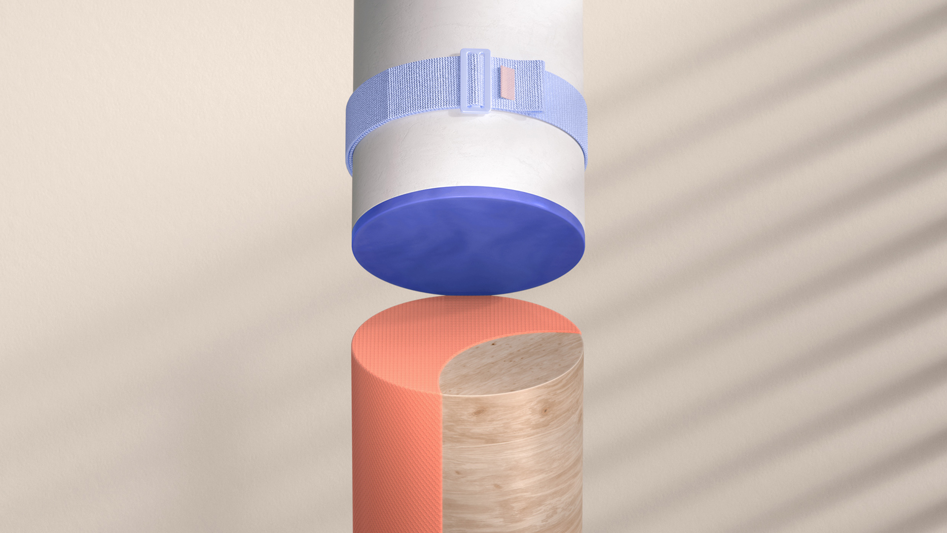
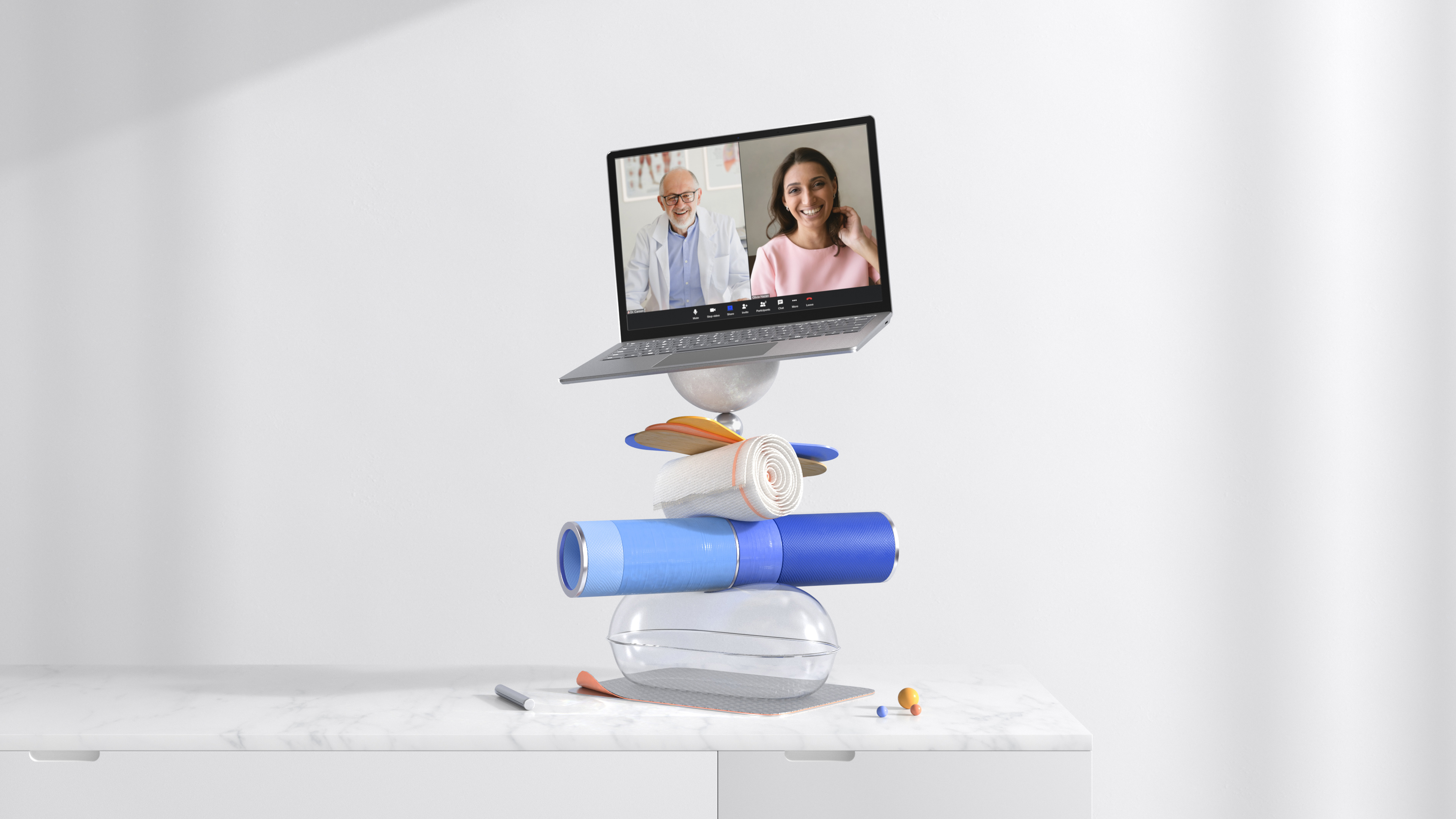
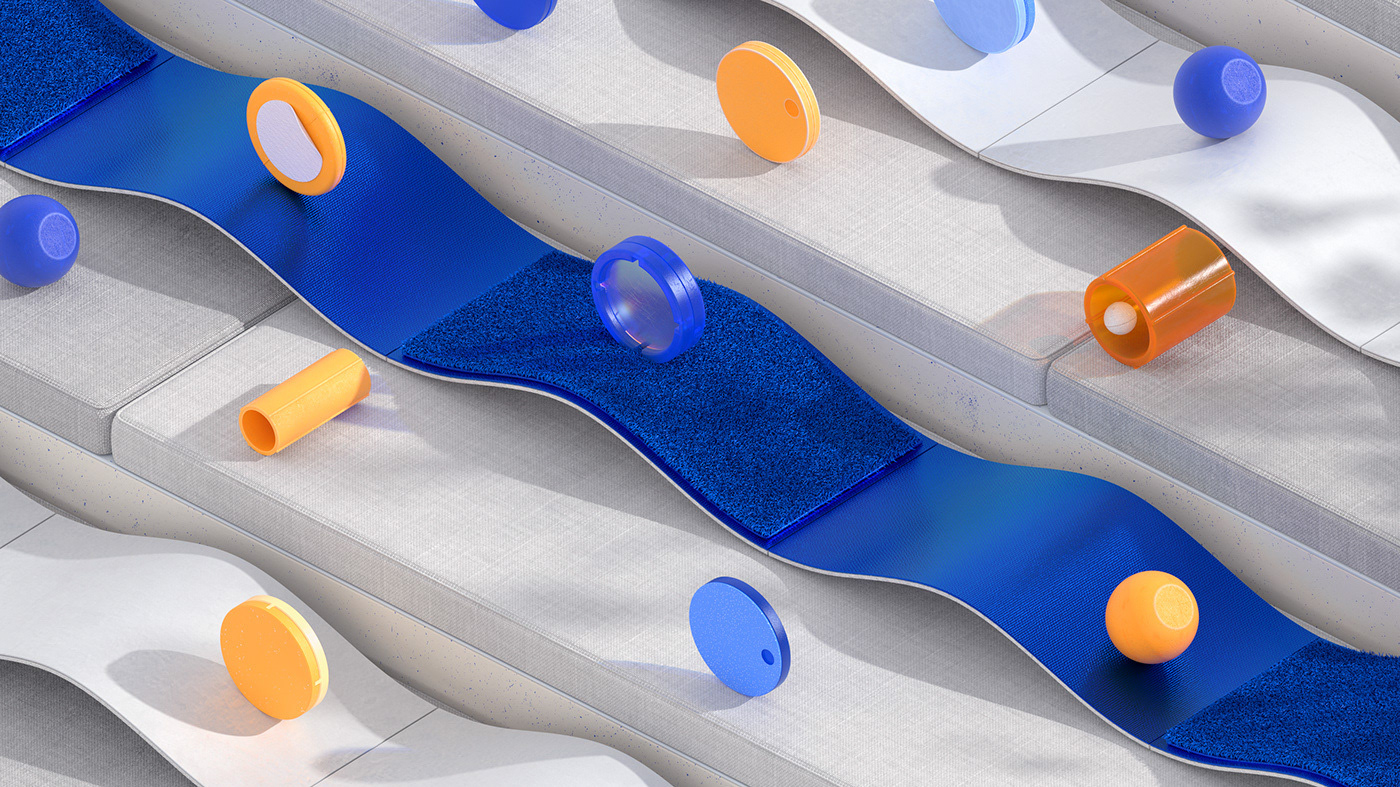
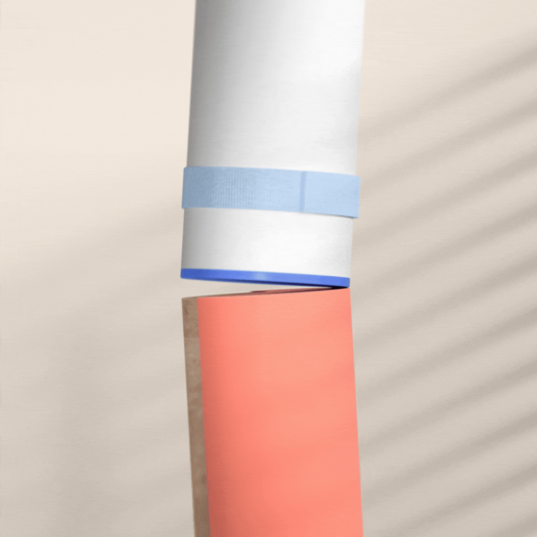
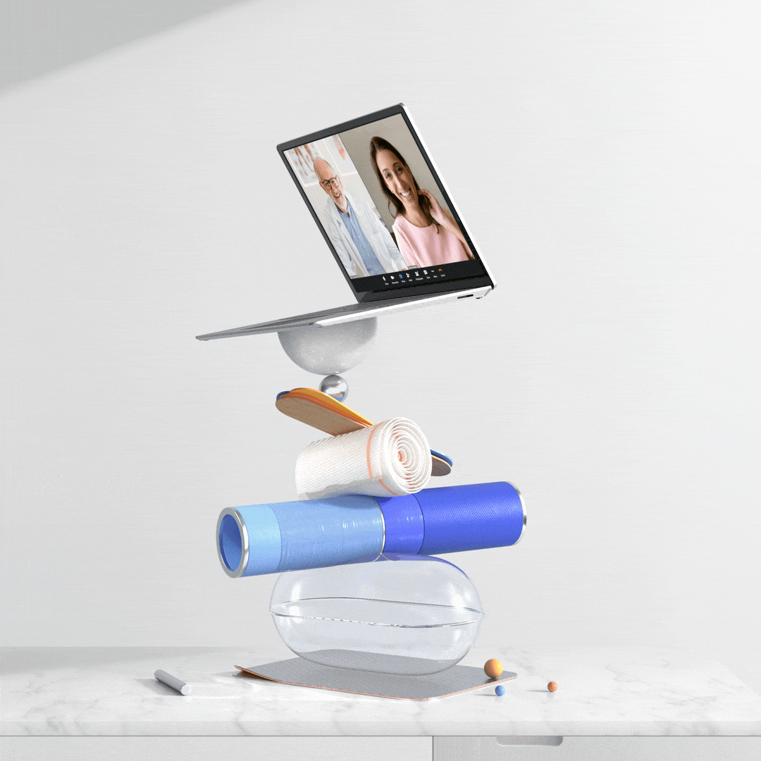
For telehealth, we worked with light, clean surfaces to give the idea of a sterile, safe space that could lend to a ‘scientific’ aesthetic.
On the totem, a mix of abstract and figurative objects that resemble the ones that could be in a doctor’s room, without being too literal: simple, abstract shapes that use materials inspired on medicine packagings and medical tools.
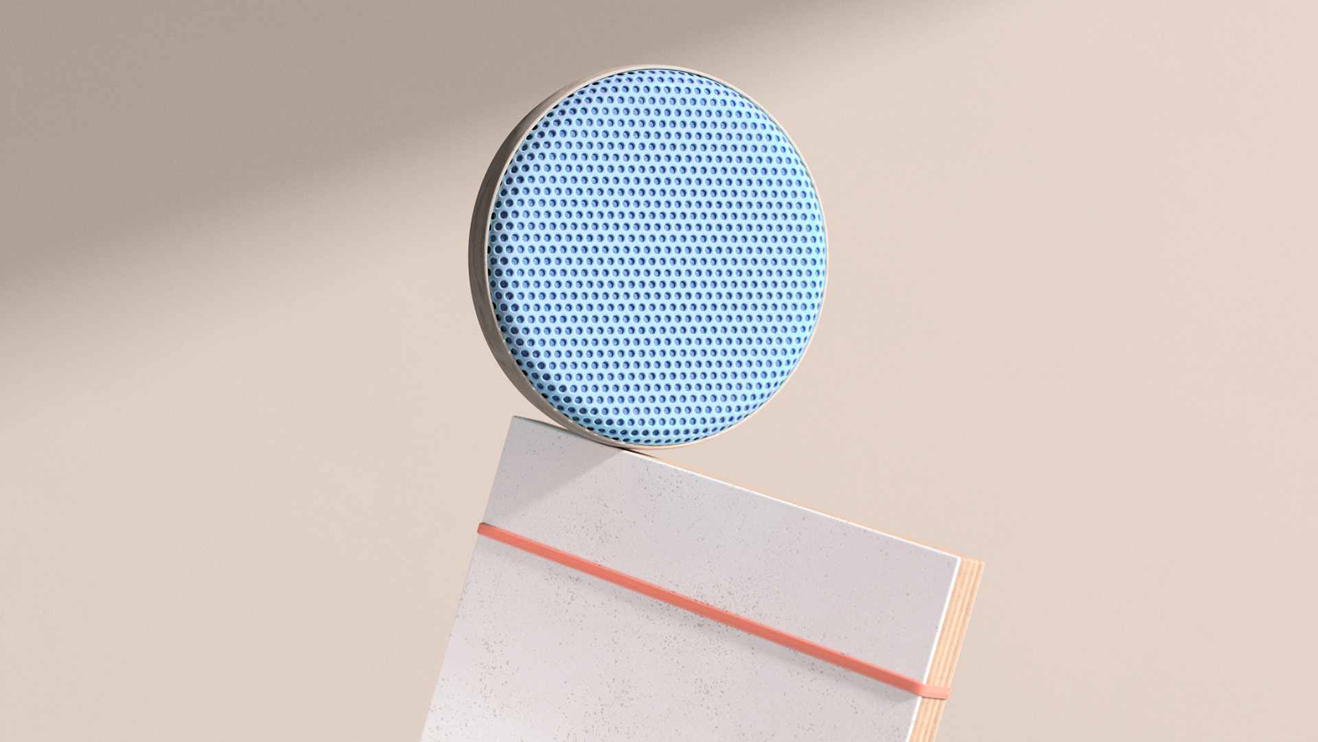

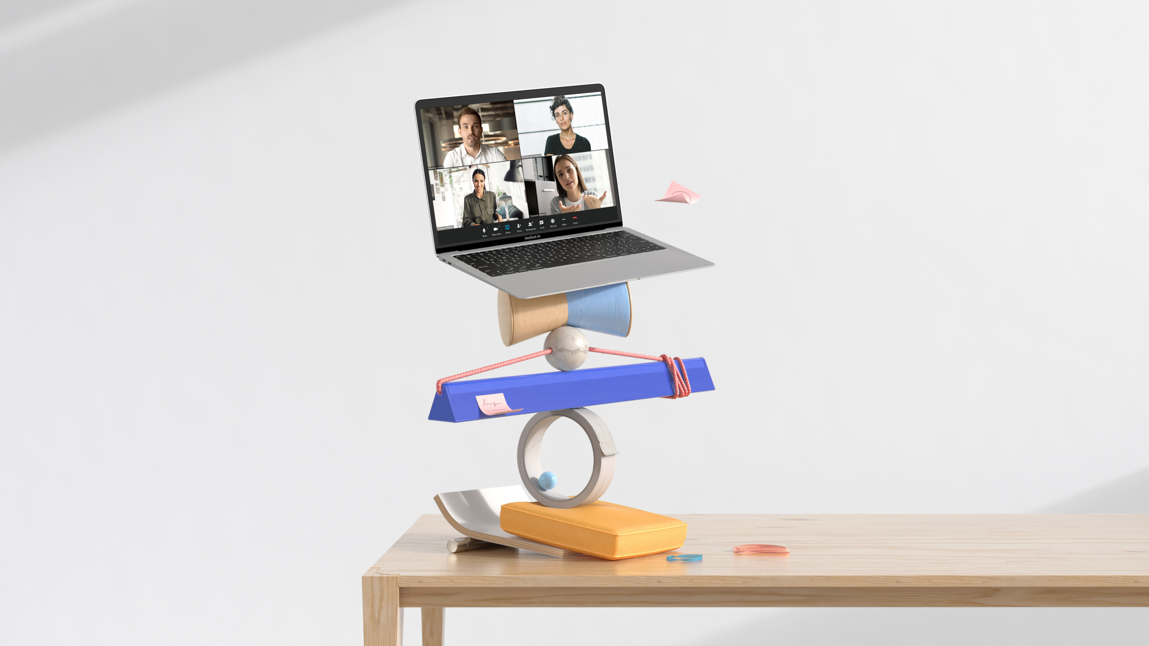
And for this second generic composition, we worked with the idea of a modern and versatile space, using just a few objects as an abstraction of a corporate office. Mainly neutral, and not too personal.
On the totem, a mix of abstract and figurative objects take inspiration from the ones that could be in a conference room: simple shapes that use materials taken out of a chair, a speaker or even a simple tube that looks like a pen, without being too literal.
Thanks!
Directed by: NotReal
Creative Direction: Valeria Moreiro & Milton Gonzalez
Executive Production: Roberto Connolly
Executive Production: Roberto Connolly
Project Manager: Martin Orza
Art Direction: Valeria Moreiro, Josefina Llano
Animation Direction: Milton Gonzalez
Animation Direction: Milton Gonzalez
Design: Flor Tasso, Alberto Carbonell, Damian Stricker, Josefina Llano, Valeria Moreiro
Lead Animator: Sergio Fuego
Animation: Juampi Sciaccaluga, Damian Stricker, Hernan Lindenbaum, Milton Gonzalez
Animation: Juampi Sciaccaluga, Damian Stricker, Hernan Lindenbaum, Milton Gonzalez
Rendering and Compositing: Sergio Fuego, Hernan Lindenbaum
Color Grading: Hernan Lindenbaum
Music & Sound Design: Facundo Capece
Agency: Cinco Design
Client: Ring Central
Year: 2021
Year: 2021